Rebecca Shore Reviewed in Art in America
April 2, 2015
NEW YORK – Shore breaths new life into the tradition of geometric abstraction.
Review, April 2, 2015
By Kyle MacMillan
Geometric abstraction boasts a rich history that dates back to the early 20th century and such artists as Kazimir Malevich and Piet Mondrian. Despite scores of countervailing movements and upheavals in the art world since, abstraction has endured, enjoying periodic bursts of renewed interest among artists.
One of the latest to breathe new life into this venerable tradition is Chicagoan Rebecca Shore. She presented two dozen harmoniously blended paintings and drawings (none larger than 25 by 23 inches) in her third solo exhibition at Corbett vs. Dempsey. In two of the three new bodies of work on view she creates a take on geometric abstraction that harks back to the 1960s.
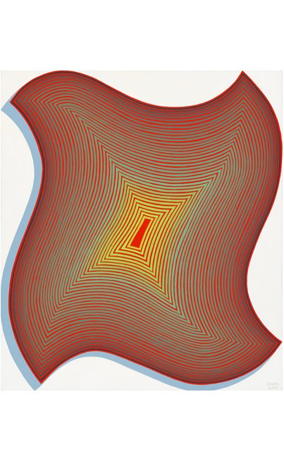
Indeed, the largest group, begun in 2013, owes an obvious debt to the vertigo-inducing Op paintings of Bridget Riley. Nowhere is this clearer than in 19 (2014), in which concentric stripes of orange and shifting greens pulsate inside a sensuous shape with four identically curved sides. Other compositions in this series feature an assortment of shapes—including Xs and ziggurats—all pressed against the edges of the square and rectangular canvases and all similarly striped with such colors as goldenrod and cool green.
A bluish shadow along the bottom and left sides of the form in 19 makes it appear to jut forward from its white background. The result is a partially convincing trompe l’oeil three- dimensionality. Indeed, that uneasy, in-between state seems to be exactly what Shore is seeking, hence the show’s title “Barely Committed to Three Dimensions.”
A closely related group (also started in 2013) is typified by labyrinthine works
like 10 (2014), with its assertive green blocky pattern on a blue ground. The more emphatic three-dimensionality of the four floating forms in 04 (2013), which resemble jigsaw puzzle pieces, and the hint of lime green that lines the very edges of the canvas, differentiates this work from everything else in the show.
Shore has flirted with geometric abstraction in the past although her previous paintings had more of a graphic-design feel, as she explored decorative silhouetted forms and the relationship between negative and positive space. This recent turn toward optical illusionism in her work is as much a departure from what has come before as an outgrowth of it.
The older strain continued in the exhibition’s third group (2013-15), in which flattened evocations of interlinked wire, rings and strands of pearls float on open fields of color. The gallery press release pointed out that faces and torsos may be discerned in the compositions, but it was easy to look at these works and not make that connection.
Also on view were 10 small gouaches, which extend the stripe and jewelry motifs in the paintings but with a cleaner, more meticulous look. These works on paper were presented salon- style on one wall. They formed a handsome installation, complementing and building on each other.